Facebook
 Google
 GitHub
 Linkedin
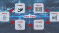
Data Flow Tutorial With Mage.ai | Part 5: Basic Data Dashboards
We begin to wrap up our data flow project with an introduction to visual-based (GUI) tools and dashboards to present the data ingested from the Google Sheets fault data source.
Check out the previous articles in this data pipeline series:
- Part 1: The Challenge of Data
- Part 2: Initializing the Software
- Part 3: Connecting to Google Sheets
- Part 4: PostgreSQL Database
In the previous article in our data flow journey, we had successfully activated the data pipeline but encountered an obstacle of poor visual presentation of the data. A database admin could potentially use command line prompts to navigate around the Postgres database, but that approach is difficult for professionals who do not specialize in this arena on a day-to-day basis. Therefore, graphical user interface (GUI) tools exist for most database systems, including Postgres.
We will now dive into the pgAdmin GUI, and showcase some of the analysis tools it offers for the fault data of our machine scenario.

Figure 1. pgAdmin logo. Image used courtesy of ashnik
pgAdmin Initialization
The first step in accessing the pgAdmin GUI will be creating a docker container within the existing bridge network of the Docker Compose file. Ensure that all existing containers are stopped by running docker compose down. Add in the following service below the Postgres database service and save the docker compose.yaml file.
 pgadmin:
    container_name: pgadmin
    image: dpage/pgadmin4:latest
    restart: always
    env_file:
      - .env
    environment:
      PGADMIN_DEFAULT_EMAIL: [email protected]
      PGADMIN_DEFAULT_PASSWORD: password
    ports:
      - "5050:80"
    volumes:
      - pgadmin_data:/var/lib/pgadmin

volumes:
  pgdatabase_data:
  pgadmin_data:
Restarting the containers by using docker compose up -d will start the pgAdmin service on localhost:5050. Within the terminal, a response similar to below should appear.
mlevanduski@Michaels-MacBook-Pro mage % docker compose up -d
[+] Running 17/1
 ✔ pgadmin 16 layers [⣿⣿⣿⣿⣿⣿⣿⣿⣿⣿⣿⣿⣿⣿⣿⣿]      0B/0B      Pulled                                                                                                28.6s
[+] Building 0.0s (0/0)
[+] Running 5/5
 ✔ Network mage_default        Created                                                                                                                         0.0s
 ✔ Volume "mage_pgadmin_data"  Created                                                                                                                         0.0s
 ✔ Container postgres-magic    Started                                                                                                                         0.0s
 ✔ Container pgadmin           Started                                                                                                                         0.0s
 ✔ Container magic             Started
Enter the localhost:5050 loopback address into a web browser to display the pgAdmin GUI. Enter the environment credentials defined in the pgAdmin service defined in the compose.yaml file to log in.

Figure 2. pgAdmin login screen. Image used courtesy of the author
Connect pgAdmin to Postgres db
After successfully logging into pgAdmin, you will be met by a friendly dashboard. One of the first steps is to link the GUI to the backend Postgres machine database that we provisioned in the prior articles. To do so, select “Add New Server”.

Figure 3. Add New Server dialog. Image used courtesy of the author
A popup menu will appear with additional fields to complete. In the general tab, a name section exists to identify the database server with a friendly name. You may name the server whatever you wish; I have chosen mageArticle.

Figure 4. New server creation parameters. Image used courtesy of the author
The red exclamation mark is prompting us to define the connection properties for the Postgres database server. Click on the connection tab and enter the parameters defining the containerized Postgres serving running on the local host machine. The “Host name/address” field should be the IP address of your host machine.

Figure 5. Adding server connection properties. Image used courtesy of the author
Upon clicking save, the server name should appear in the left-hand Object Explorer menu.
pgAdmin Table Data
In order to see table data from the mage.ai pipeline in part 4, we will expand the Object Explorer menu in a descending manner from server -> database -> schema -> table. The Faults table (or whichever Google Sheet name you chose) should appear in the hierarchy. Please note you may need to rerun the manual “Run@once” pipeline trigger in the mage.ai pipeline and refresh the pgAdmin browser window.

Figure 6. Location of the ‘Faults’ spreadsheet (complete file tree has been truncated for image clarity; yours may be longer). Image used courtesy of the author
To visualize the Faults table values, select the View Data button located at the top of the object explorer window.
Upon selecting this button, a center dashboard will appear with an overwhelming amount of content. Do not be alarmed, many database systems have a similar UI. Once you learn one, any subsequent systems become easier to understand.

Figure 7. Partitioned information from the ‘Faults’ spreadsheet. Image used courtesy of the author
Let’s break down the UI above. The query pane was auto-generated by selecting the view data button. The query serves as a critical component in all relational database systems. It communicates with the database and returns the data requested by the query. The language of most relational database management systems is Structured Query Language, or SQL. In the auto-generated case described, the query is pulling all records from the Faults table and ordering them in ascending order based on the google spreadsheet row ID.

Figure 8. Query organized by spreadsheet row number. Image used courtesy of the author
The data output tab below reflects this request. Examining the first 3 rows, we can see that the _google_sheet_row ID begins at 2 for the first row returned and incrementally increases as you scroll downwards in the result set. Furthermore, we can see the “fact” table records we loaded through the mage.ai pipeline in the form of the “date” and “fault” columns.

Figure 9. Specifying the ‘data’ and ‘fault’ rows of the spreadsheet. Image used courtesy of the author
An ad-hoc data analysis approach, similar to the Google Sheet chart in part 1, can be accomplished within the pgAdmin tool. Clicking on the Graph Visualizer button will generate a visual chart of the resultant data set of the query.
Within the graph visualizer menu, select the following options, and click “Generate” in the top right-hand corner.

Figure 10. Generating the visual graphic element. Image used courtesy of the author
Remarkably, we will get a bar chart of the resultant query dataset. The data is not aggregated and thus not ideal for presentation purposes.

Figure 11. Non-aggregated data display. Image used courtesy of the author
Creating a new SQL query can change the graph visualizer into a format that is more desired for presentation purposes. Enter the following SQL statement into a new query editor window. This statement performs an aggregate count function on the fault data and then groups the counts associated to the respective descriptions.
SELECT
	fault,
	COUNT(fault)
FROM
	public."Faults"
GROUP BY
	fault
The resultant dataset should be similar to below.

Figure 12. Tabulated set of fault data and count number. Image used courtesy of the author
The resultant graph visualizer tool will yield a much more effective graph to present to management.

Figure 13. Aggregated bar graph display of fault data. Image used courtesy of the author
The Final Visualization Steps
The pgAdmin tool has enabled us to explore the data in the Postgres database. From where we started, this is a major win. Data can be automatically collected based on a desired trigger and funneled into a robust data storage tool. The majority of the difficult work is complete. In the next section (forthcoming), we’ll explore some data dashboarding tools that accomplish the job of presenting to management better than that of Google Sheets and pgAdmin.