Facebook
 Google
 GitHub
 Linkedin
Human Factor Engineering: Designing an Intuitive HMI
Designing a control system is a difficult task in itself, but designing the graphical interface for an everyday user can be a very different kind of challenge that involves mental and physical considerations.
Ever jump in a rental car and find that buttons, switches, and control levers were not where you thought they would be? This used to be a more common problem, especially if you found yourself driving a strange car in a different country on the wrong side of the road. Fortunately, over the years, designers of this common human-machine interface (HMI) have made the chances of you flipping on the brights instead of turning on the wipers fewer and far between. Industrial HMIs, on the other hand, are used to display process data, operating metrics, ID process variables and control operating systems. In contrast to most automotive dashboards, industrial HMIs are very system-specific. If a control button is positioned poorly, and pushed by accident, for example, the outcome could be catastrophic! That's why it is extremely important for control engineers to design intuitive, standardized HMIs.

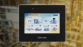
Figure 1. A very simple HMI. This experiment needs no emergency stop, just a regular machine stop at the lower right corner. The key feature is the shape of this graph, so it takes up the majority of the window. Image used courtesy of the author
Location, Location, Location
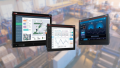
HMIs are used to replace physical controls in many cases. A computerized oscilloscope replaces the benchtop model, for example, saving space and system complexity. One good place in HMI design to start is to make the interface display an image of the physical device it will replace. Though it's not mandatory to deliver a carbon copy, control functions and displays should share more similarities, not less. Typically, power/start buttons are located in the bottom right corner, and menus are listed along the top, for example. Often, the data display is on the left, and control buttons are on the right, though this standard was developed to help right-handed people operate more efficiently, putting southpaws at a slight disadvantage.
Current HMI displays mimic other well-known devices. Visualize a status indicator shaped like a traffic light, for example. The top (red) position indicates a shutdown or failure, the middle (yellow) position indicates a warning status, and the bottom (green) position indicates no issues at all. It would not be very prudent at all to move these positions around, because people intuitively understand the colors and signals of traffic lights.
Human-machine interface designers know the most important information should be positioned at the center of the screen. If a major fault or emergency stop is activated it should be displayed in the center of the screen. Otherwise, nice-to-know, extraneous information, such as port connection status messages and operating credentials, should be displayed at the edge of the screen to minimize any distractions.
Colors and Shapes of Controls
Color alone is not sufficient to convey critical information. While standardized colors are important, other more obvious cues might be necessary so users clearly receive and interpret this information. Consider the colorblind. In this case, a subtle color change would be hard to recognize. This is particularly true with men, who are more likely to be diagnosed with colorblindness and work in industrial environments.
To mitigate the issue of colorblindness, designers add other visual cues, including textboxes to indicate status or other familiar shapes. Most countries use an octagon for their road stop signs, so making a red octagon that says “STOP” is a clear indication of how to stop the machine, regardless of color blindness, language barriers, and so on.

Figure 2. This stop sign is in the universal shape, indicating a STOP command, even if you don’t understand the written language. Image used courtesy of Adobe Stock
Speaking of text, a properly designed HMI will allow the user to increase the font size or be able to zoom into components to support people who may have visual impairments. Also, consider a worker who needs to monitor a process, but has other tasks to perform. The relevant display can be made large enough to view from another workstation.
Focus and Pop-up Interactions
One of the most frustrating things about industrial HMIs is when a computer decides to give a certain window or control priority. Certain messages, including emergency stops or equipment faults, should take priority. This forces the user to acknowledge the condition before returning to routine or normal tasks.
Suppose a certain HMI has a feature where comments can be added to a data file to document process excursions. Something happens to cause an excursion, so the worker dutifully begins to type a detailed comment explaining the situation. During that time, a few relatively unimportant status messages pop up, constantly taking control of the cursor, and causing the user to stop typing to deal with the pop-up. This is a disincentive and may prompt operators to write less-detailed comments.
Along the same lines, menus and submenus should only have a few items and be limited in scope whenever possible. Look for opportunities to condense menus to reduce unnecessary clicks. Pop-up windows should also be limited to critical emergency messages, where the user must directly acknowledge the problem before moving on. User attention is guaranteed when the pop-up window is centered vertically and horizontally. For extremely important messages, some HMI designers ask the user to type their initials or demand some other way to acknowledge the error, so it won't be ignored or missed.
Customizable Dashboards
In certain operator roles, some data streams may be more important than others. Rather than developing a one-size-fits-all HMI, the user has the power to determine which items are important and where they should be placed. For the advanced user, the ability to customize his or her dashboard is really convenient.

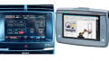
Figure 3. If dashboards are used, any customization controls should be respectful of the user’s experience level; would they be frustrated by a changing interface? Image used courtesy of Control Automation
For the new user, customizable dashboards can become frustrating, as it represents yet another set of controls to learn. Most new users ignore the potential and are likely to use the dashboard the trainer has developed. Furthermore, an errant click and drag, or a system lag can lead to extra frustration, and that's not a good thing.
To design a customizable dashboard, certain features should be permanent. Emergency conditions and certain status messages should be displayed consistently across all HMIs, regardless of how the rest of the interface is customized. Also, to aid the new user, there should be a way to lock the customizable features to prevent users from accidentally modifying their dashboard.
HMI Human Factor Engineering
HMIs and humans will continue to evolve. HMI development is ongoing and as new tools become available, the guidelines mentioned here may be subject to change. Artificial intelligence and language recognition are already making a huge impact on HMI development, allowing the user to speak commands rather than clicking buttons and searching through menus. Advanced eye-tracking software coming on board and represents yet another technology supporting the development of HMIs.
Ultimately, good HMI design puts the operator first, displays and indicates operating and condition data clearly and concisely while promoting desired responses and mitigating human error.