Facebook
 Google
 GitHub
 Linkedin
Going Gray: A New HMI Standard
Some standards for HMIs recommend monochromatic schemes for clarity. How can you help operators cope with a new HMI standard after many years of operating without one?
Personal computers have now been used in automation as a graphical user interface (GUI) for over 30 years. In that time, many changes have occurred from the technology, terminology, capabilities, to the standards and guidelines that are used to create the interfaces.
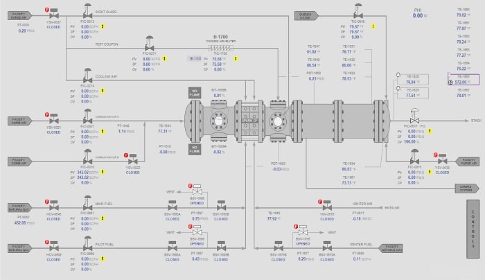
Figure 1. Revised HMI screen using guidelines in ISA-101.
In the process and automation industry the GUI, which is more commonly known as a Human Machine Interface (HMI) has evolved over the years to leverage the advances in the capabilities and technology to become a robust and reliable common place for any process control or automation project. In the early years of its use, the HMI was developed without many standards or guidelines to go by. Trial and error forged many of these early standards.
One of the organizations to develop standards early was the ISA (International Society of Automation). By the mid-80s, ISA had included some graphics guidelines in various standards and other organizations had also followed suit with their own guidelines and standards as well.
The standards that ISA had developed and released in the 80s, were based on the technology at the time and by the early 2000s, it was apparent that those standards were due for a makeover. In 2006 a committee was formed to establish an updated/fresh set of standards for implementing, using, and/or managing HMIs in the process control and automation applications. In July of 2015, ANSI/ISA-101.01-2015 HMIs for Process Automation Systems was approved and released.

Figure 2. Original HMI screen before implementing ISA-101 guidelines.
The need for ISA-101 came from the experience and feedback obtained from various industries concerning the use and implementation of many “bad” HMIs. There are several key elements that routinely were blamed for the poor design of the HMI. Data was now abundant and it began to overload the operator and the graphic displays. The resolution of the displays kept getting better, and overuse of “fancy” three-dimensional objects and animation and color littered the screens of control rooms across the globe. Operators were inundated with hundreds of alarms with no sense of priority or purpose. Sadly, poor design sometimes had more fatal consequences in the form of major accidents and catastrophes.
Use of Color
The use of color, or the lack thereof, is only one small facet of the ISA 101 standard, but it is often the aspect that gets most associated with the standard. Early displays often used color for many purposes, and it wasn’t always clear what the color meant to the operator or user.
Color was used to indicate the state of equipment and valves as well as contents of process lines and vessels. The color was used in alarm displays and typically was left up to the designer or customer to determine what the different colors represented. The use of color was not universal across industries and sometimes not even across facilities within the same organization. This caused confusion and inconsistency in the industry and a standard was desperately needed.
The ISA 101 standard tends to recommend a more monochromatic color scheme for graphic objects, making the displays appear bland at first glance. One of the more popular color schemes used by many when developing ISA 101 style graphics relies on contrasting shades of gray for most background objects and controls, thus earning the sometimes used term “Grayscale Graphics”.
Getting operators used to a monochromatic color scheme after years of working with the older style graphics may not be as difficult as it first seems. Operators and the casual users' first impression of the graphics is often negative and without even using the new system they declare the older style “better”.
With training and repeated use of the new system, opinions quickly change. This is especially true when shortcomings of the old system are suddenly realized only after using the properly implemented ISA 101 style graphics.

Figure 3. Rockwell Automation white paper on style guides. Image courtesy of Rockwell Automation.
Color is helpful when used in the right way. Overuse of color can drown out information that is critical to an operator or user of a system. Color should be used sparingly and only where attention is needed such as alarms and abnormal equipment and / or instrument modes or states. The mantra I tend to use with operators is “Gray is Good” when referring them to the new system as they absorb the lack of color on the screen when there are no abnormalities present. When they see color on the screen it means attention is needed and the operator's focus is quickly brought to the areas with color.
Consistency, Upgrades, and New Features
The ISA 101 standard emphasizes consistency and recommends developing a style guide before even attempting to create the first graphic display. The style guide should contain detailed guidelines and be used as the roadmap for creating and maintaining your HMI. Consistency is key to creating an intuitive and predictable interface for the operators. The Rockwell Automation white paper on style guides is a good starting point or reference for your own style guide. Some key features that should be addressed in a style guide are:
- Display Levels
- Display Layout and Templates
- Display Hierarchy and Navigation
- Dynamic and Static Symbol Standards
- Dynamic and Static Text Standards
- Faceplate and Popup Standards
- Alarm Functionality and Organization
- Data Logging
- Historical Trending
- Security
- Change Management

Figure 4. Valve control, permissive and alarms faceplates provide valuable information for operators.
To help win over operators and users with all the changes in the new system, provide them with upgrades and new features that will make their job easier and more productive. This can greatly help entice the operator to embrace the new HMI. Sit down with operators before the upgrade and involve them in the design process. Find out what they like about the existing system and what they don’t like. Fix shortfalls of the old system and it will help make the new system seem superior even though the same could have been done in the old system.
Change can be difficult to adjust to, but bad changes are even tougher. To help your operators and users accept the changes you have made to their HMI, make sure that what they are left with is beneficial to them and help explain the reasons behind the changes.
Explain how the things they see as different are better and listen to their feedback. Provide compromises where it makes sense. Continuously evaluate the effectiveness of the new systema and adjust as needed.